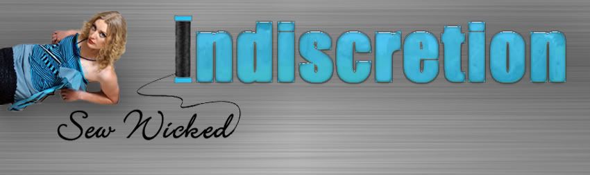
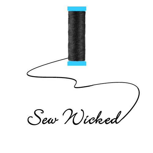
I wanted to play off the name of my business - Indiscretion, but also associate it with sewing.
First I started with this:
My friend Sheika looked it over for me and suggested alone, the spool doesn't look like a spool, but with the full name, it looks like a spool of thread.
I used Impact for the font, but it looked too fat. Also, I asked a few friends and my husband, and they thought Sew Wicked would relate better.
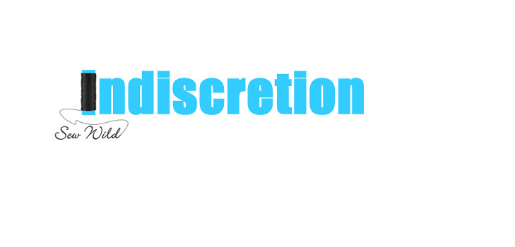
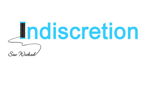
So I did this, one with all Arial letters, one with Arial, but I used a different font for the "spool" to make it look more like a real one. Which do you like better?
1)
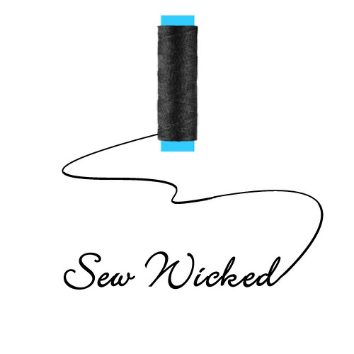

2)
7 comments:
I like the second one better! I think the "I" looks more like a spool. :) Sea Marie
Thanks for looking - I have a feeling many would agree with you. :D
Mara, I like the second spool but also am a fan of the bulkier font on the first "sew wild" logo. Looks awesome!
I do like the second one better, and I love the idea of using the spool as the I for your name!
Second One!!!!!!
I like the second one, as well. But I agree with Jan--I like the bulky font, too.
Anyway, what a great logo idea!
The second versions are nice, I like that you can have a banner or an avatar image. For example, the full Indiscretion logo with spool could be your Etsy shop banner and the Sew Wicked spool image could be your avatar. Everything would tie in quite nicely.
Post a Comment